
Something Different
In order to create a business card worth remembering, sizes outside the scope of traditional business cards were considered. When looking at the wallet – the main carrier and also placeholder of business cards – an idea was born. There is a location where business cards are stored, but also forgotten. Why not create a business card stored in another compartment of the wallet?
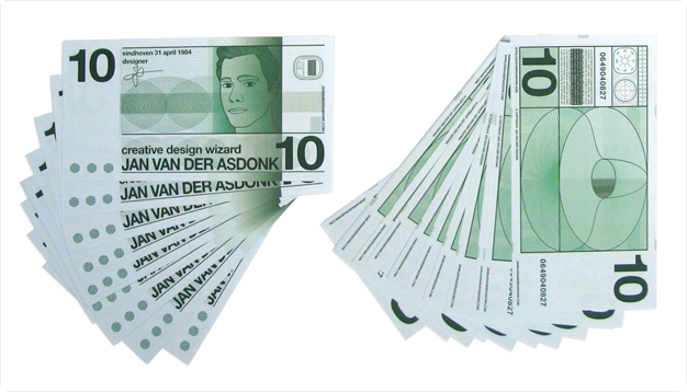
A banknote business card is placed in the section housing all the banknotes. Using a similar size, feel and styling; the recipient is exposed to the business card on numerous occasions when handling their money. Upon inspecting the business card during these moments, the threshold of actually throwing it away is too high. And also, while regular business cards are eventually stored in another location, this design eludes these moments of relocation while not residing in the conventional compartment for business cards.
The Business Card
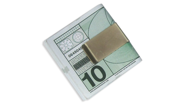
The Money Clip
In order to keep the banknotes neatly stacked together, a money clip was purchased. This maintained the overall banknote-feeling of the business cards and increases the impact when a business card is handed over.

The Design

The banknote was designed as a reference to the old Dutch 10 Gulden note, a favored design of old times. Instead of the blue used in the 10 Gulden note, a green color was implemented. This way the money would stand out next to the existing Euro banknotes, while still maintaining a sense of money.
Name and Title
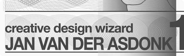
In order to place all the necessary information found on common business cards into the banknote design, some subtle details were added. For one, the name and title of the designer are displayed as the value and name of the bank.
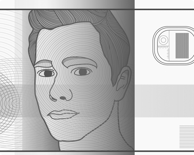
The Photo
To create a visual of the designer, a photo was hand-traced using the pen tool in Adobe Illustrator. This took considerable amounts of time, as the line-drawing style is cumbersome to construct.
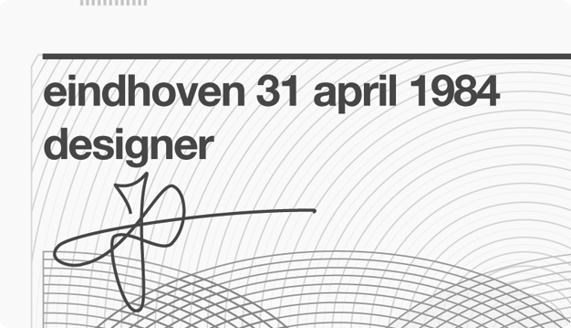
Place, Date, Title, and Signature
Instead of placing the date when the banknote was signed, a small play was made regarding the date of birth of the designer. Instead of the actual date of birth; December 14th 1984, a fake date was printed; April 31st 1984. This was done because the word “december” was too long to place in a significant font size. Further, the signature and title “designer” were added.
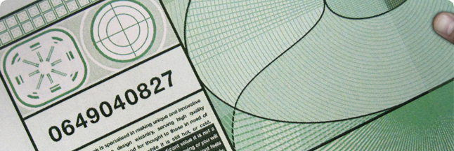
Serial Number, aka Phone Number
Additionally, the serial number of the banknote is also the mobile phone number. Let’s hope this does not change any time soon. UPDATE: this is no longer my phone number, please send me an email instead.

Company Name and Web Address
Furthermore, the name of the printing company is now the name of the designer and web address of the portfolio.

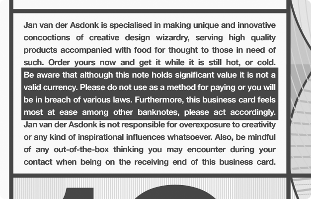
The Disclaimer
Also, a miniature disclaimer was placed on the back. It reads a short explanation of the designer’s skills, a statement of not being a valid currency, and finally a warning for any over-exposure to creativity.
A Watermark
Finally, a watermark was added of a previous product design (the afterlife artifact product) and placed in a low opacity setting on both sides. It can be seen on the right-hand side of the image below. In the future this might change into other, more recent designs.

Stats
completed in: March, 2010
time spent on project: numerous nightly hours
stakeholders: me and whoever is on the receiving end
links: blogged at Soultravelmultimedia