
Mental Trickery
With the creative process you never know when the idea will hit you, if it ever comes at once. This project is one of those examples where the idea hit and stuck with me.
Qarc is a brand identity for the startup quark company of Leonie van Zuilichem. The word ‘qarc’ is based on a subtle trick of the mind: the pronunciation of the word changes after making the connection with the product, quark.
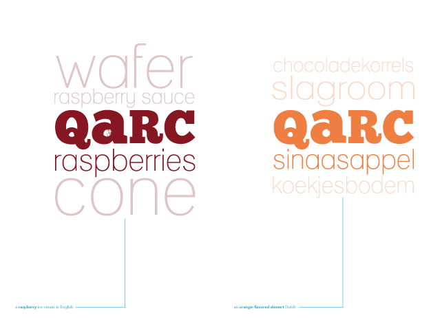
The wordmark adapts to the specific flavours by using colour and graphic variations that are identifiable at different distances: wordmark – colour – flavour – graphic twist.
Read the process below, or download Qarc’s Brand Identity Story that illustrates the story.
The Wordmark
The Flavours
The wordmark is adapted to a range of different flavours, which can be utilised over a long range of products, adding new tastes if necessary.

The Packaging
The packaging plays with a secondary layer of information that houses the ingredients, both above and below the wordmark. This direction was nicely scaled into a first sticker-based packaging solution. Using this approach, the packaging can easily be scaled to a wider range of products, with new flavours added constantly. Below an overview of 4 packages for the smaller 150g cup.
* Please note: the development process of the orignal Qarc brand was completed in 2011, after which various subtle colour and shape changes have taken place that are not reflected in the following section. For the most up-to-date work see the examples above.
The Process
The following section tells the story of how the Qarc brand came to be, displaying the highlights and insights into all the graphical details which evolved their way into the brand identity and logo design.
Competition
There is a tremendous competition in the field of consumer goods. In todays supermarkets, goods battle for your attention. They scream at you with their elaborate array of colours, typefaces, and graphical elements.
Finding a spot in between these enemies can been seen as an arduous task. Many try to accomplish this by implementing a variety of different techniques to catch your eye, instead of offering visual relaxation.
From a consumer’s perspective the majority of brand diversity and complexity is becoming progressively overwhelming.
Some brands continuously reinvent themselves, in order to find a grasp on the changing consumer. Others stick to one identity, trying to create a lasting brand memory.
A favouring direction focuses on a more minimal approach. Instead of all the clutter, less is more. Gone with all the details and colours, using only the core elements to represent the brand and product. Such an approach breathes more, and offers visual relief.
Ultimately, the goal is to stand out. To be perceived. To be noticed. To be sold.
Stickiness
Stickiness is a vital ingredient for any new brand. The name should stick.
Some brands have names that offer no clue as to what their business is. These names would probably feel uncomfortable at first, yet made their name based on the products they sold.
Take for example Apple. It’s a computer company. Not a fruit company. The name isn’t linked to their business. Yet it’s known everywhere. When the name originated in 1979, competition was little. In 2011, things are different.
In these modern times it becomes increasingly complex to obtain a unique name. Especially with the ever-growing internet name-game.
Sticking random characters together increases the chance of spawning a unique name, but this is not always the preferred tactic.
A solution to this problem is finding a play on an existing name. This creative twist could spark a moment. A moment where people stop and think about the name. Understanding the twist, and enjoying the result. Expecting nothing, getting something.
Name
The product in question is quark. It is the basis for many more products in the intended business.
Why not make a play on that word? Create a new and unique word by altering characters, while retaining the unmistakability of the word.
How about ‘qark’?
The ‘q’ is spoken similar to the word ‘cue’, making the pronunciation of the word similar to quark, and – in Dutch – kwark.
It is short, and punchy. It does not fool around, yet mystifies by using a ‘q’, a rare and less used character.
The word does not exist in both English and Dutch dictionaries, except for a few abbreviations. It is a unique word, creating an opportunity for a no-compromise website address.
People always look at words before they are read. In this case the twist becomes obvious once the word is read in ones mind. This results in a nifty surprise. A twist making the word, and brand, remembered. ‘Qark’ becomes ‘quark’.
Also, the word holds its own Dutch and English making it easy for future international endeavours.
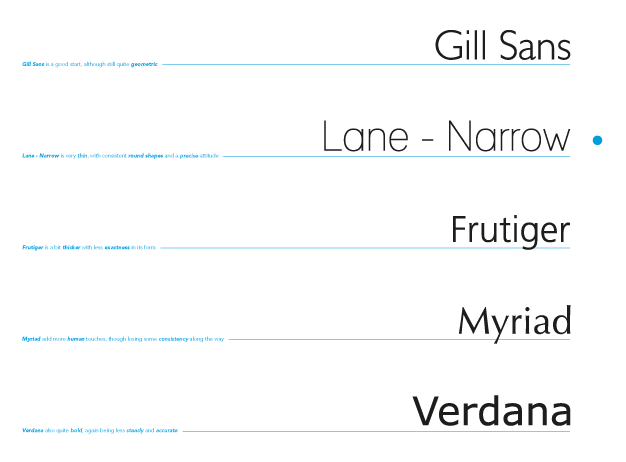
Font Family
For this name we need a wordmark. And choosing the font can be a dazzling process. In order to provide an overview of the different families involved, a summary has been made.
With five different groups, the choice can become more obvious when looking at the characteristics of the company and name.
The word ‘qark’, with a connection to its origin; the word quark, has a heavy feel to it. It is thick of substance, and is the bearer of lighter flavours.
For that reason, and in being the prime name of the company, it must hold a sense of authority. It should stand its own among all the other typefaces around.
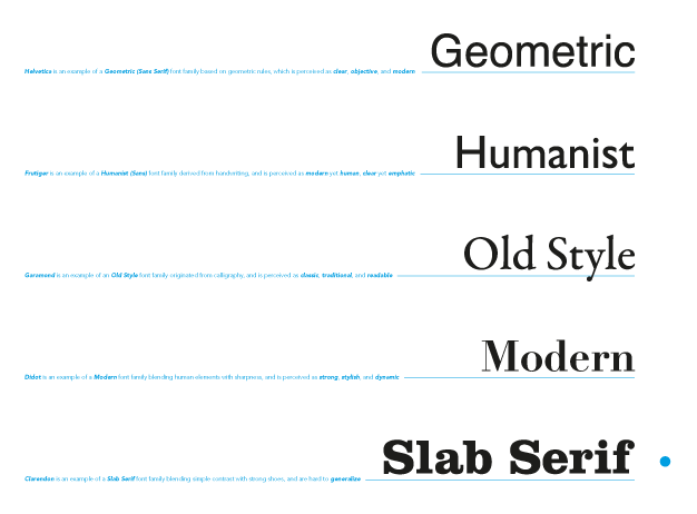
Also, a human and hand-made twist should be present. No strict minimal lines. There should be a varied contrast in thickness, with a small focus on more fluent lines.
It should not compromise these characteristics for its strength and sovereignty.
Combining all these elements, the choice is made to go with a Slab Serif font family.
Typeface
Making a distinction between the different Slab Serif typefaces is done by falling back on the original desired characteristics.
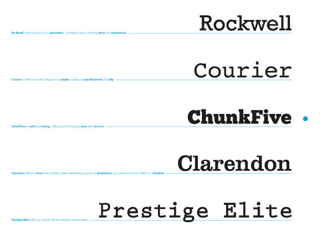
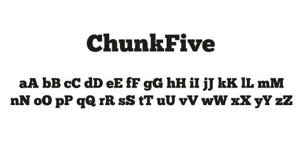
By comparing these five typefaces and looking at their respective forms, the choice is made to use ChunkFive based on its authority while providing a more hand-made touch.
It is strong and solid, easily overpowering the other typefaces. Yet it still has playful rounding, varying its thickness here and there.
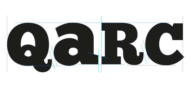
Capitalisation
With normal typefaces in small caps a problem arises when characters cross what is know as the x-height.
In this case the Q and K stick out above this so-called x-height. The Q has a descender, and the K has an ascender.
By changing the capitalisation to caps or small caps, and adjusting the height to match the x-height, the word becomes more powerful.
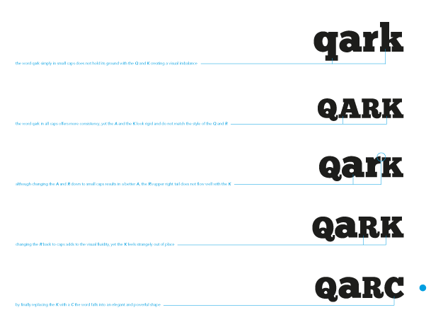
The characters and their respective cap-sizes are also selected based on qualities of cross-character blending.
In one of the first tries the rigidity of the A and K showcase this obvious incompatibility. This results in the word changing from ‘qark’ to ‘qarc’.
Flow
An important aspect in the visual quality of a word or set of characters is flow.
Our brains seek relationships. This is true for visual language, where our mind tries to connect and create shapes. This is a called the Gestalt effect, and was developed in Germany during the 1920s.
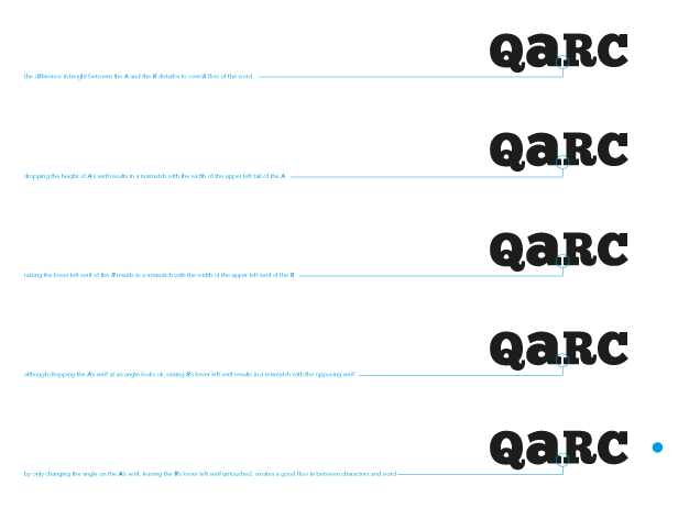
In order to create a positive flow, one must take into account this Gestalt effect.
When looking at the characters, a mismatch occurs between the A and R. This is solved by playing around with their respective lines until a qualitative conclusion is found.
Wordmark
The final wordmark incorporates a flow paying respect to the overall qualities it represents.
Flavour
The second part of the products in question, besides the quark, is the flavour.
It requires a good visual presence, as taste is something that is only experienced when consuming the product.
While the quark provides a solid basis, the flavour adds a delicate touch.
It has to provide a signature aspect to complete the logo. Qarc is not about quark alone, it is also about flavour.
As is logical, flavour is the opposite of the carrier, quark. It should be light, thin, yet also precise. Based on these characteristics, the conclusion is easily drawn to use a Humanist font family.
For its human and empathic aspects, a humanist font family provides a clear link to the custom detail of a home-made quark.
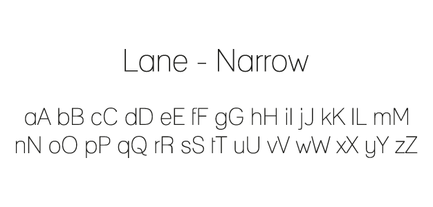
For this reason, the Lane – Narrow typeface offers the best properties for the job of representing the flavour.
Products
With the proper typeface selected, it is integrated on a secondary location below the more primary logo.
The width of the flavour is the same as the width of the primary logo.
This way they are perceived as one strong entity, with a clear distinction between logo and flavour.
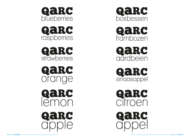
Using obvious flavours such as apple, lemon, orange, strawberries, raspberries, and blueberries, the notion becomes clear.
The spacing between the top of the x-height of the flavour and the bottom of the x-height of the logo is exactly twice that of the distance between the logo’s characters.
Colour
Colour is one of the best visual indicators. Even before a word is read, colours are identified.
To increase the quality and speed of recognition, each flavour holds a different colour.
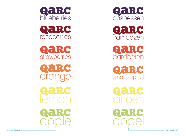
As the flavour also adds taste to the quark, it too will sport the same colour.
The hues and saturations are chosen based on real-life colour samples to provide an accurate yet vivid picture. Ultimately they will be adapted to whatever medium they are printed on.
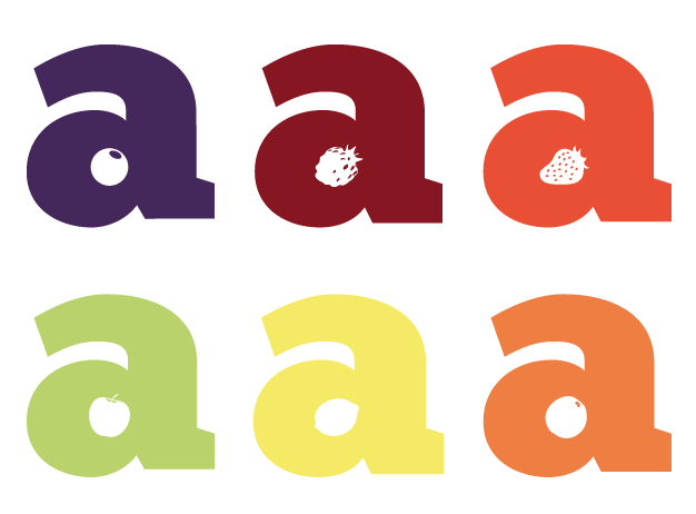
Graphics
To provide another layer of recognition, small graphic elements are added.
These elements are based on the actual kinds of fruit for these respective flavours. Using graphical interpretations, the target area for these elements is inside the counter of the A.
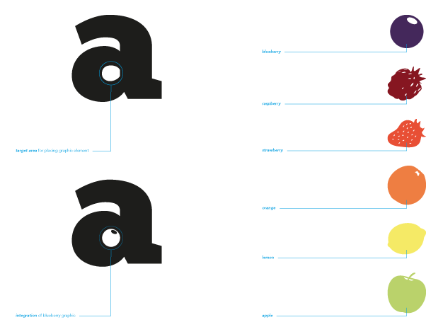
Ultimately, this graphic addition adds another creative twist to the already intricate logo combination.
It offers detailed and playful insights while maintaining a professional and custom appearance.
Ingredients & Packaging
While the flavour presents the main aspect of the product, there is also the product category. In this case: is it a dessert, ice-cream, a cake, or something else?
There is no question that the product category is easily exhibited through the packaging, simply because a something as ice-cream does not look like a cake.
Conclusion
In conclusion, Qarc is a very unique and versatile brand identity.
Unique in that creates a creative twist using its semantic and pragmatic meaning.
It lends itself to a wide range of uses, be it simple flavours, or more complicated products.
It is fresh, using a detailed typography-based design, resulting in a playful yet professional appearance.
It exhibits minimalist looks, creating some visual relief among its visually overpowering competitors. It stands out by being different.
The colours is easily adapted to its target flavour. Instead of a very sharp contrast, the colours provide a soft pretence. This adds to a more natural feeling, as an alternative to more artificial sense.
It is a polished creation, providing the backbone for a growing identity with a wide range of qualitative products in more than one category.
Qarc will be about quark at first. After some time, it will be an established brand, venturing outside the world of quark, and into new uncharted territories.
And it will do so comfortably.
Stats
completed in: November, 2011
time spent on project: Fun knows no time
stakeholders: Leonie van Zuilichem