
An Infographic
Some time now infographics have been a trending visualization in the marketing world. Companies in the procession of vast amounts of data and knowledge use the skills of graphic designers to visualize their complex information.
OBI4wan is one of those companies. Specialized in online business intelligence, OBI4wan offers webcare platforms and insights in online communication. They analyze more than 15 million Dutch tweets every week, gaining valuable insights in Dutch Twitter usage.
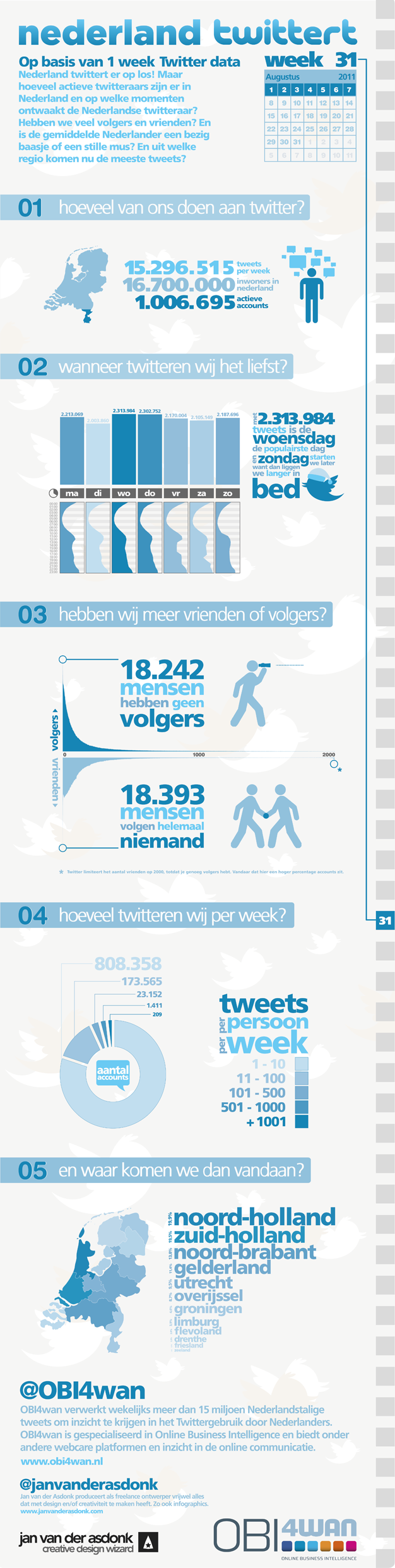
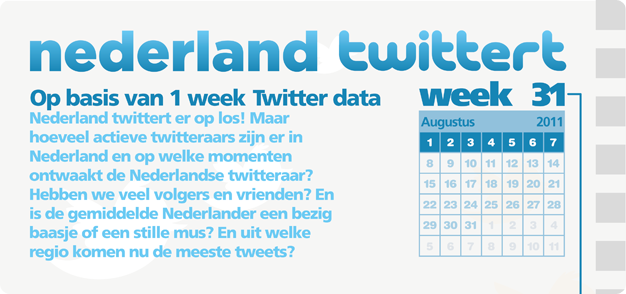
So an infographic was commissioned. As a first, Dutch-spoken tweets were analyzed on numbers, moments, and origin. Account location were founded solely on input by users themselves, thus offering not the completest of data on that topic.
Later, a second infographic was made using data from the Flanders region of Belgium (not pictured here).
Press Pack
The Dutch infographic can be downloaded as a press pack here (.zip file, in various qualities and sizes).
The Full Infographic

The Design
More information on the details and design inside the infographic can be found below.
The Date
In being the first infographic, the data of one week was used. In this case, week 31: 1 to 7 July. The infographic at that point was made with the thought of weekly updates in mind. So in sticking to the visual, a small agenda was added. Also, 52 small cubic shapes (in accordance with the year’s 52 weeks) were added along the right side, graphically representing the current week.
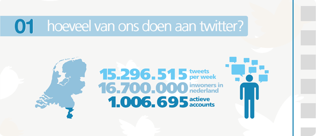
Tweets and Population
The first header dealt with the number of tweets (15.296.515) versus the population of the Netherlands (16.700.000) and the number of active accounts that week (1.006.695). The map showcased a comparison between the tweets and population using the matching colors of the text.
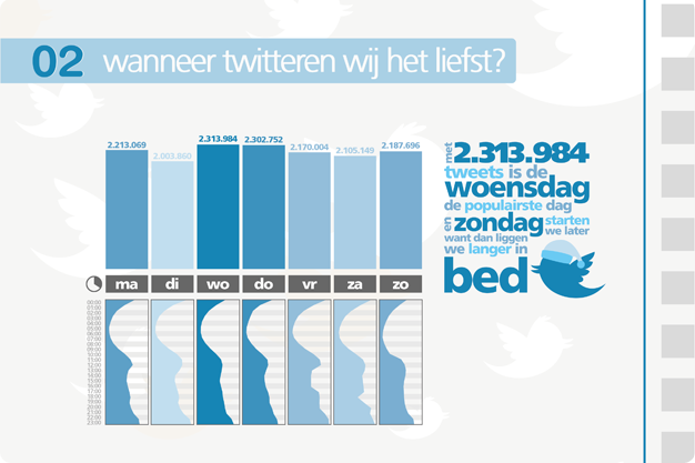
Tweets per Week and Hour
The second part covered the tweets per week and hour. The top part showed the activity per day, the higher and darker the bar, the higher the number. The bottom part showed the tweets per hour, 24 hours per day. The graphic to the right depicted a Twitter bird with a sleep bonnet, illustrating that Twitter activity is a little bit later on Sunday because we probably “start” a little later that day.
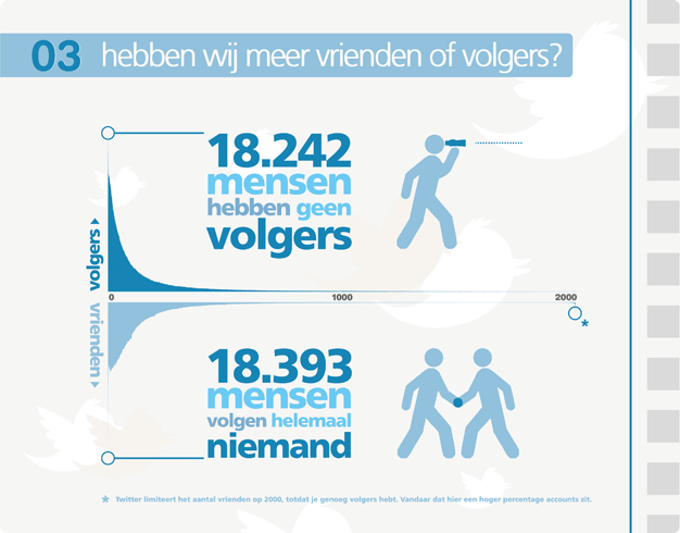
Friends and Followers
Part three represented the comparison between friends and followers. The top graph shows the followers and the bottom friends. The choice was made to put and emphasis on the people not having any followers nor friends. Another important detail is the 2.000 friends cap set by Twitter. If you wish to have more than 2.000 friends, you need a large amount of followers. Therefor a lot of people stop at 2.000.
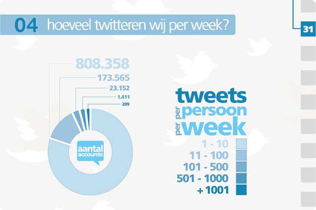
Tweets per Person, per Week
Now that we know hoy much tweets are send out, and on what day and hour these proliferate, it is time to figure out the amount of tweets the average account communicates on that given week. The graphic displays the tweets per person per week, summarized in various groups between the 1 and 1.001 plus. It seems there are 209 people that week who sent more than 1.001 Twitter messages.
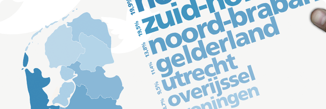
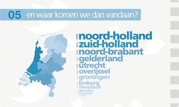
Tweets and their Origin
The fifth and final part explained the percentage of tweets and their respective origins. A map of the Netherlands was divided into its provinces, using color and coherent text-size to present the data.
Stats
completed in: August, 2011
time spent on project: about 25 hours so far
stakeholders: OBI4wan
links: blogged at OBI4wan, Marketingfacts, DutchCowboys, Twittermania, Online Promotie, Syvo, Social Media Tools, NieuweMedia, Cc:live, Victor Weblog, Infographipedia, XYDO, Starter zoekt starter, and Recruiting Roundtable Nederland.